B4. Audio & User Interface

Learning Outcomes
- Add and configure audio sources in Unity, distinguishing between diegetic and non-diegetic sound. Ahead of class, open Unity, attach an
Audio Sourceto a GameObject, enable looping, adjust volume, and play a short sound effect while considering how sound placement impacts XR immersion.- Implement spatial audio effects for immersive XR soundscapes. As preparation, set an audio source’s
Spatial Blendto 3D, configure distance falloff, then move the player in Play mode to hear changes in spread and directionality.- Create and position UI elements for both overlay and world-space contexts. Before the session, add a
Canvaswith aTextMeshProlabel and aButton, then switch the Canvas render mode between Overlay and World Space to compare presentation styles in XR.- Use anchors to make UI elements responsive to screen size changes. In advance, place a button in the top-right corner using Anchor Presets, then test different Game view resolutions to confirm the position remains consistent.
- Configure interactive buttons that trigger actions in Unity. Prior to class, create a button that toggles a GameObject’s visibility via
OnClick()and adjust its hover and pressed states in the Color Tint settings.- Implement toggles to control GameObject properties. For your prep work, add a toggle that switches an Audio Source on or off, replacing the default label with a
TextMeshProlabel that reads “Music.”- Build sliders to dynamically adjust audio properties. Before coming in, create a slider that modifies an Audio Source’s volume, label it “Volume” using
TextMeshPro, and set its starting value to 0.5.
Audio
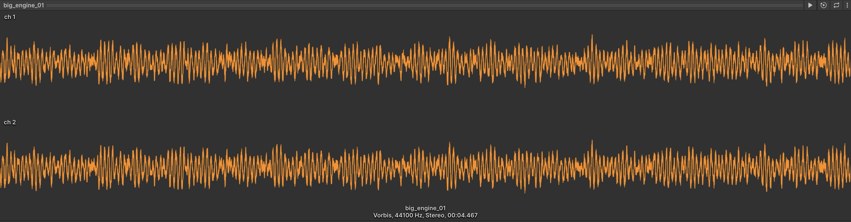
Audio is a crucial element in immersive experiences, yet it is often overlooked. In interactive games or XR applications, sound plays a significant role in shaping user perception, guiding interactions, and reinforcing realism. A well-designed audio system enhances engagement, while poor implementation can break immersion. Unity provides a powerful built-in audio system that allows developers to create realistic soundscapes. For XR, audio should support presence without overwhelming the user. Use looping machine sounds, alerts, and voice cues deliberately, and avoid filling the scene with too many constantly playing sources. Audio design should also consider comfort, accessibility, and performance on the target device. Unity’s built-in audio system supports 2D/3D playback, attenuation, mixers, and reverb zones. More advanced binaural/HRTF spatialization may require a platform or plugin spatializer, depending on the target headset.
In XFactory, for example, audio can add critical depth to the simulation—such as the subtle humming of CNC machines, robotic arms whirring, or the clanking of parts being assembled—improving realism and training effectiveness.
Core Audio Components

Unity’s audio system is based on several core components. The two most important beginner components are:
-
Audio Listener: This component acts as the ears of the user within the Unity environment. It captures and interprets sound based on spatial relationships between sound sources and the user’s position. It is typically attached to the
Main Camera. Therefore, only one activeAudio Listenershould exist in a scene. It determines how sounds are heard depending on user location and orientation. In XR projects, the active listener should usually follow the user’s head/camera, not a fixed scene object. -
Audio Source: This is the component that plays a sound. It’s attached to a GameObject and emits an audio clip with various customizable parameters:
Audio Generator: The audio asset the source plays. In Unity 6.3, this can reference anAudio Clipor anAudio Random Container. Older tutorials or screenshots may show similar fields labeledAudio CliporAudio Resource.Output: Routes the sound directly to the listener or through anAudio Mixergroup.Volume: Controls loudness.Loop: Repeats the sound continuously.Play On Awake: Automatically plays sound when the scene starts.Spatial Blend: Controls how much Unity’s 3D audio engine affects the sound, from 2D to 3D.Pitch: Alters playback speed and pitch.Priority: Helps Unity decide which sounds are most important when many sounds play at once.
In XFactory, the listener follows the user’s head in a VR headset, adjusting the volume and direction of sounds as they explore the factory. As a user walks into the welding station, the sizzling of arc welders becomes more prominent, while the drone beeping from the logistics station fades away.
Sound Types
- Diegetic Sound (In-World Sound): These are sounds that originate from within the scene and are heard by both users and virtual characters. In XFactory, examples of diegetic sounds include forklift engines revving in the logistics station or 3D printer layering noises in the production zone.
- Non-Diegetic Sound (External Sound): These are sounds that don’t originate in the scene itself but enhance atmosphere or guide user experience. In XFactory, ambient background music during the onboarding menu, notification tones when an objective is completed, or dramatic stingers when transitioning between factory zones are all examples of non-diegetic sounds.
Common audio file formats in Unity include
WAVorAIFFfor short, high-quality sound effects, and compressed formats such asOGGorMP3for music and longer ambience. For XR, choose format and compression settings based on quality, memory, loading time, and platform support.
Adding Audio
- Creating Sound-Emitting GameObjects:
- Select a GameObject (e.g.,
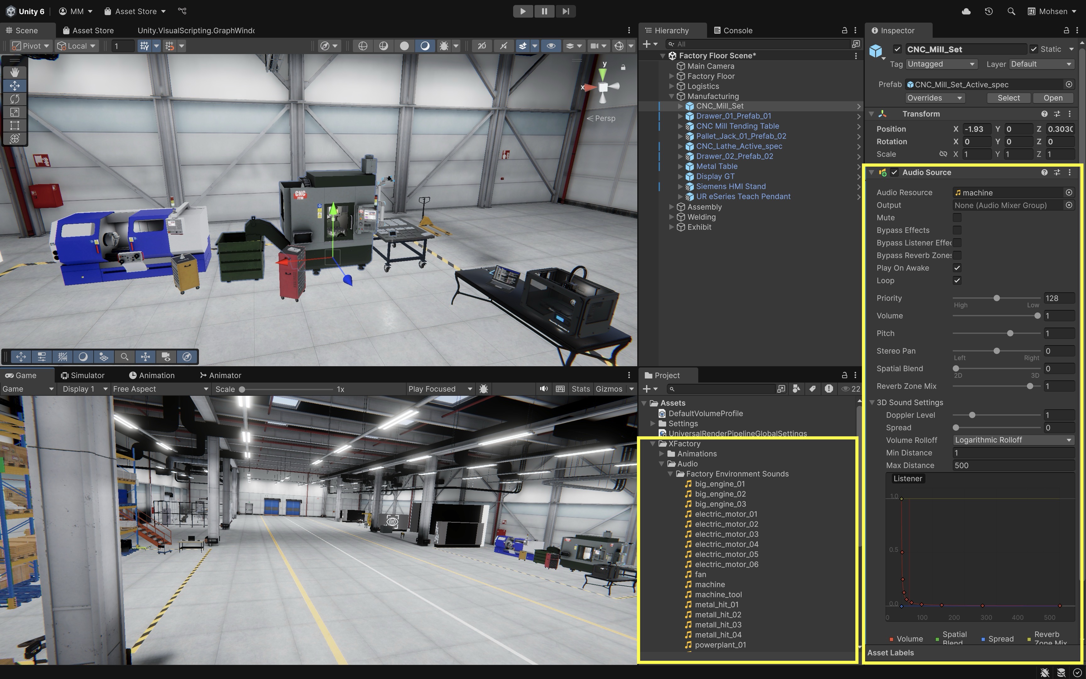
CNC_Mill_Setin the manufacturing station). - In the
Inspectorpanel, clickAdd Component > Audio Source. - Drag an audio clip into the
Audio Generatorfield (e.g.,Assets > XFactory > Audio > Factory Environment Sounds > machine.ogg). - Enable
Loopfor continuous operation sounds like machining. - Adjust
VolumeandPitchto simulate different machine loads or tool types. - Test in
Playmode to verify how the sound behaves as you move around the machine. - Through Quest Link, you can hear the same test in your Meta Quest headset while staying in the Editor.
- Select a GameObject (e.g.,
- Playing Background Music:
- Right-click in
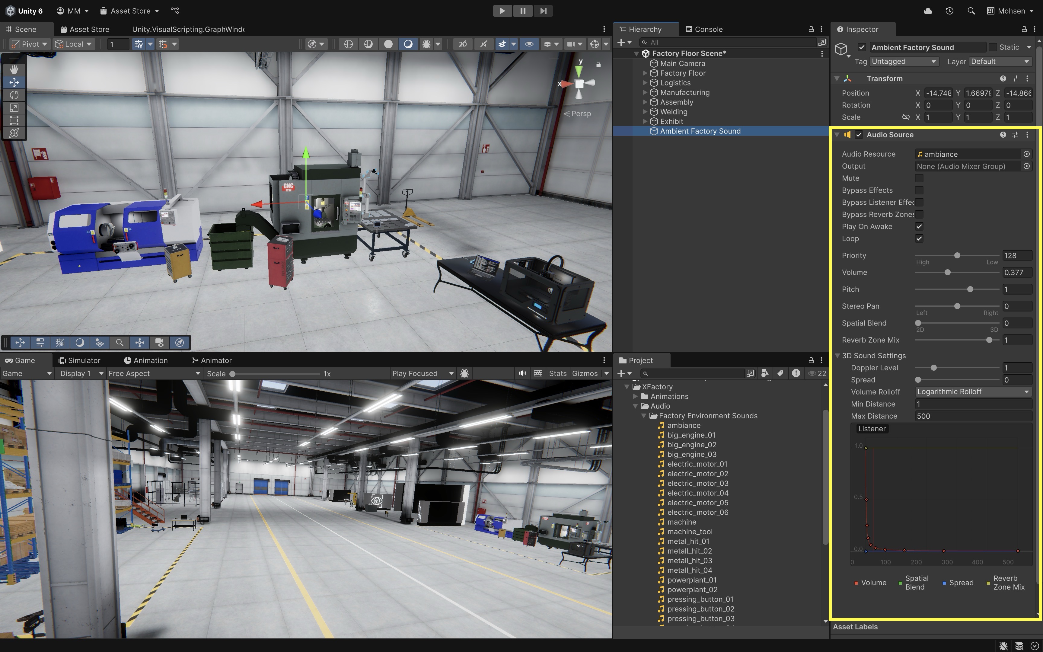
Hierarchy > Create Empty. - Name it
Ambient Factory Sound. - Add an
Audio Sourcecomponent. - Add an ambient track to the
Audio Generatorfield (e.g.,Assets > XFactory > Audio > Factory Environment Sounds > ambiance.ogg). - Enable
Loopand setVolumeto a subtle level.
To ensure critical sounds are not drowned out in busy scenes, adjust the
Priorityslider in theAudio Source. Lower values mean higher importance;0is highest priority and256is lowest. The default is usually128. For larger scenes, route related sources such as machinery, ambience, UI sounds, and voice guidance into separate Audio Mixer groups. This makes it easier to balance, mute, or duck categories of sound later. - Right-click in
Accessibility Considerations
To ensure inclusive audio experiences, integrate the following into auditory interactions with the user:
- Closed Captions: Provide on-screen text descriptions (e.g.,
[robot arm clicks],[machine hums]). - Visual Feedback: Pair sounds with icons, flashes, or animations.
- Custom Audio Settings: Let users adjust or mute background music vs. sound effects separately.
- Separate Volume Controls: Let users control music, ambient sound, effects, and voice guidance independently.
- Redundant Cues: Important alerts should not rely on sound alone; pair them with visual or haptic feedback.
In XFactory, users with hearing impairments can be provided with a “3D Printer Operating” notification when the audio cue would normally play. Visual waveform overlays or light flashes signal machine activity.
Spatial Audio and Audio Mixing
This section covers audio features that go beyond basic playback: spatial positioning, environmental reverb, and mixer-based control. These tools help XR scenes sound more believable, organized, and accessible without overwhelming the user.
Spatial Audio

Spatial audio helps users perceive where sounds are located in relation to their head, body, and environment. Unity’s built-in 3D audio supports distance attenuation, panning, Doppler effects, spread, and rolloff curves. Full binaural/HRTF spatialization depends on the target platform and whether a spatializer plugin or headset-specific audio system is enabled. In XR applications, spatial audio is essential to enhance the user’s spatial awareness and comprehension in use cases such as:
- Training and Safety: Simulating industrial environments where audio cues—like beeping of forklifts, alarms from malfunctioning machines, or alerts from PLC HMIs—signal hazards and guide user attention.
- Prototyping and Design: Enabling real-time walkthroughs of virtual factories with contextual machine sounds, making it easier to evaluate layout and acoustic behavior.
- Data Sonification: Turning complex sensor data (like pressure or torque values) into audio signals for easier real-time interpretation.
In XFactory, spatial audio can greatly enhance realism and engagement. The humming of CNC machines, the whirring of drone propellers, or the clank of metal parts being assembled by robots not only provide atmospheric immersion but also convey important contextual information about what’s happening in different areas of the factory.
Spatial Audio Settings
Spatial Blend: A slider from0to1that controls how much Unity treats the sound as 2D or 3D. Set it to1for fully 3D distance and direction behavior.Volume Rolloff: Controls how sound volume decreases as distance from the listener increases.Min Distance: The distance within which the sound remains at full volume.Max Distance: The distance used by some rolloff modes to control when attenuation reaches its limit.Spread: Controls how widely the sound is distributed in speaker space.Doppler Level: Controls pitch shift caused by relative motion. Use carefully in XR, because exaggerated Doppler effects can feel unrealistic or distracting.Spatialize: Enables a custom spatializer if one is installed and selected in project audio settings.
Adding Spatial Audio
Let’s revisit the existing setup by converting the CNC machine’s Audio Source to spatial audio for realistic 3D sound behavior in Unity using the XFactory environment.
- Convert Existing Audio Source to Spatial:
- Select the CNC machine GameObject in the
Hierarchy(CNC_Mill_Set). - In the
Inspector, locate theAudio Sourcecomponent. - Verify that an appropriate clip is assigned in the
Audio Generatorfield (e.g.,machine.ogg) andLoopis enabled. - Set the
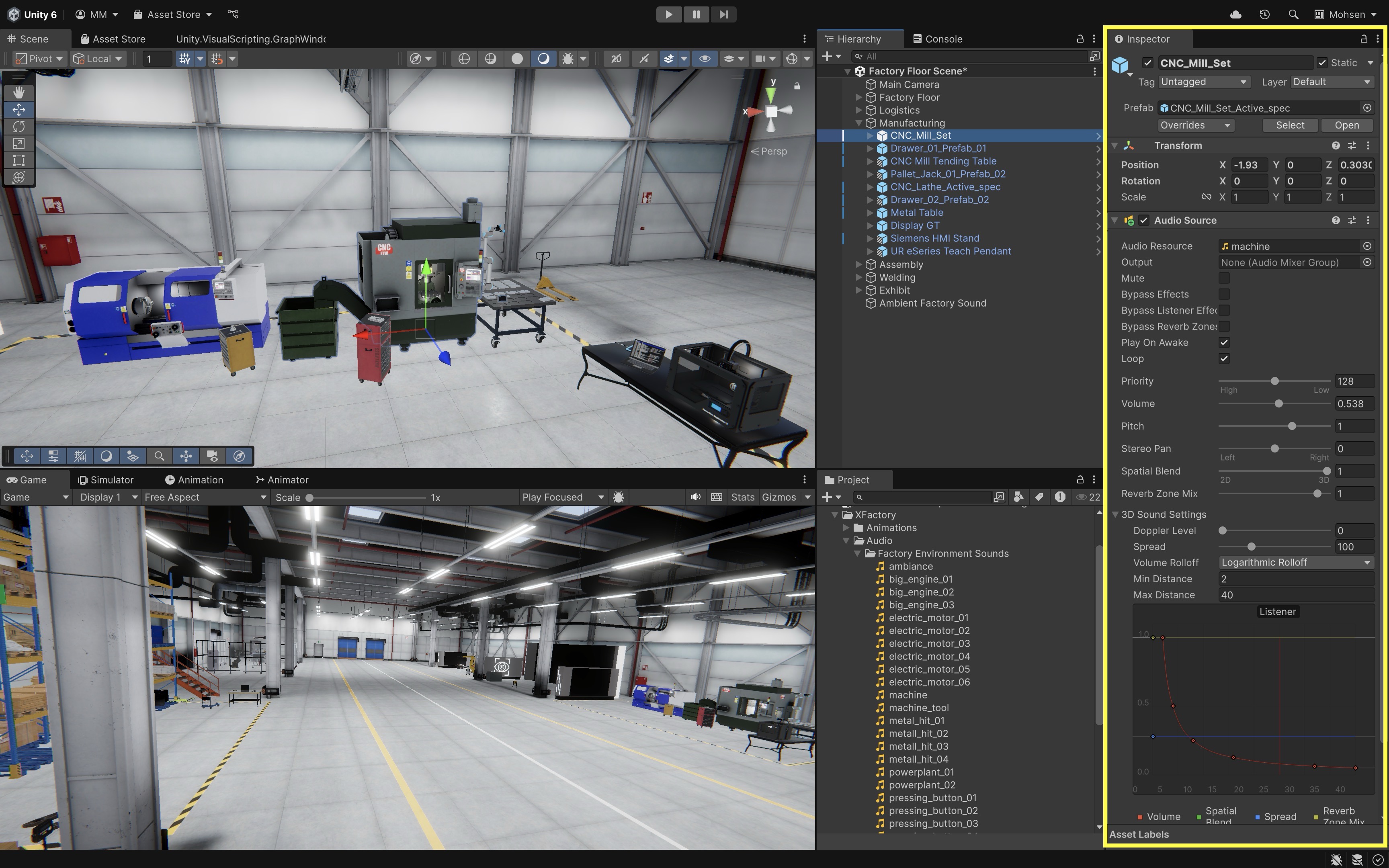
Spatial Blendslider fully to3Dto make the sound position-based.
- Select the CNC machine GameObject in the
- Adjust 3D Sound Settings:
Min Distance: Set to2–3for CNC machines. This is the distance where the sound plays at full volume.Max Distance: Set to30–50to define how far the sound can be heard.Spread: Set between90–150to simulate how sound fills the space and transitions between ears as you move.Doppler Level: (optional) Set to0for stationary machines, or around1.0if the sound source may move (e.g., on mobile platforms).
- Choose a Volume Rolloff Curve:
- Expand the
3D Sound Settingssection in theAudio Source. - Choose a
Rolloff Mode. Logarithmicoften feels natural for localized sound sources because volume drops quickly at first and then tapers off.Lineargives a direct distance-based fade and can be useful when you want predictable cutoff behavior.Customallows you to design your own curve for special materials or dampened acoustic zones.
- Expand the
- Test the Setup:
- Press
Play. - Move near the CNC machine and observe how the sound grows louder as you approach.
- Rotate around it to check directional audio behavior.
- Move away and confirm the sound fades based on the
Max Distanceand rolloff curve.
- Press
- Optimize Listener Position:
- Proper listener placement ensures immersive audio response.
- If using a player or XR rig, make sure the active
Audio Listenerfollows the user’s camera/head position. In many Unity XR setups, this means leaving the listener on the XR camera. Avoid having more than one activeAudio Listenerin the scene. - Walk through the environment in
Playmode and listen to how audio shifts across logistics, assembly, and production zones. - The same walkthrough can be done in a Quest Link–connected Meta Quest to judge spatial audio before Module D.
With spatial audio applied, your CNC machine now produces immersive sound feedback that responds to distance, orientation, and player movement—ideal for XR training, robotics simulations, or factory walkthroughs.
Audio Reverb Zones
Sound waves interact with the environment in ways that affect how users perceive space. Hard, enclosed surfaces can create reverberation, while soft or irregular surfaces absorb sound. Unity’s built-in Audio Reverb Zone can approximate environmental reverb in a spherical area, but it does not automatically simulate full acoustic propagation or occlusion. For this course, use reverb zones as a simple way to suggest acoustic differences between factory areas. Learn more in the Reverb Zone documentation. In XFactory, the production station where CNC machines and robotic arms operate in close proximity might benefit from a “Factory Hall” or “Concrete Hall” preset to reflect sound bouncing off metallic and concrete surfaces.
- Create a
Reverb Zone:- In the
Hierarchy, use the+menu orGameObject > Audio > Audio Reverb Zoneif available. If the menu location differs, create an empty GameObject and add anAudio Reverb Zonecomponent in the Inspector. - Rename it appropriately (e.g.,
XFactory Hall Reverb).
- In the
- Position the
Reverb Zone:- Move the reverb zone to the center of the echoing environment.
- Adjust the
Min Distanceto cover most of the enclosed space. - Adjust the
Max Distanceso that it slightly extends beyond the area.
- Select a
Reverb Preset:- In the
Inspector, locate theReverbPresetdropdown. - Choose an appropriate preset (e.g.,
Hallway). - Playtest and tweak settings as needed. With Quest Link active, you can hear the reverb change in your Meta Quest headset during the same Play Mode test.
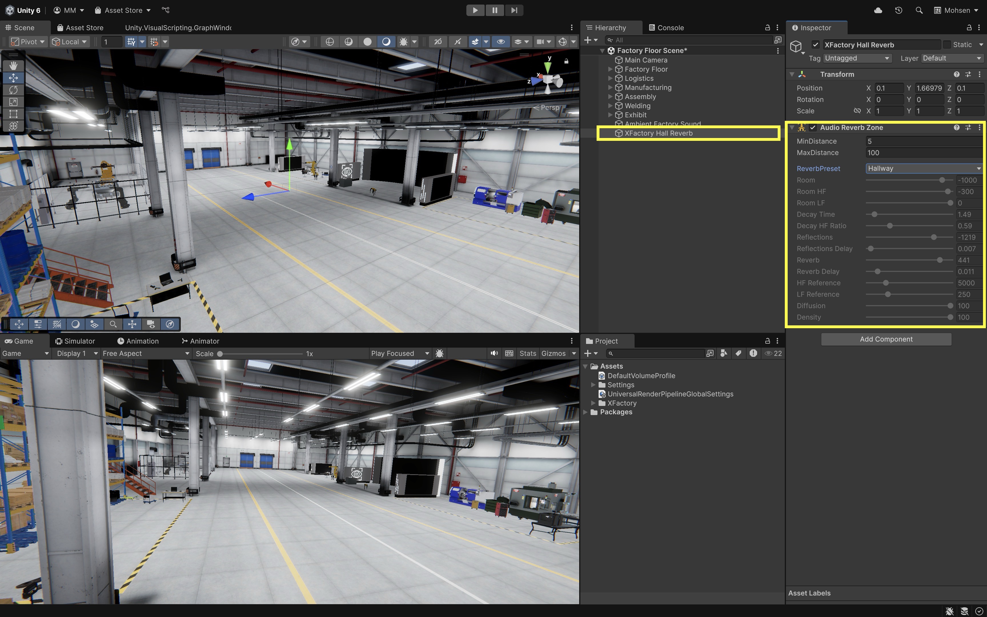
Unity provides multiple
ReverbPresettypes that simulate real-world environments. Experimenting with these helps fine-tune the desired effect. In advanced implementations, reverb zones can be scripted to activate when a player enters the space and deactivate when they leave. - In the
Audio Mixer
The Audio Mixer allows precise control over groups of sounds, enabling volume balancing, effects, routing, snapshots, and dynamic sound mixing based on game events. In XFactory, for example, you can use the mixer to balance sound levels between CNC machines, robot movement, and PLC beeps. You can also simulate focus or guidance modes by reducing machine sounds when voice instructions, warnings, or onboarding narration are active. For an XR simulation, useful mixer groups might include Ambience, Machinery, UI, Voice Guidance, and Warnings. Keeping these separate makes accessibility and debugging easier.
- Open the
Audio Mixer:- Navigate to
Window > Audio > Audio Mixer. - Click the
+button to create a new mixer. - Rename it (e.g.,
XFactory Audio Mixer).
- Navigate to
- Create an Audio
Groupfor Machine Sounds:- Click
+in theGroupssection. - Rename it
Machinery.
- Click
- Assign Sounds to the Mixer Group:
- Select an
Audio Source(e.g., CNC machine hum). - Locate the
Outputproperty in theInspector. - Select the
Machinerygroup from the dropdown.
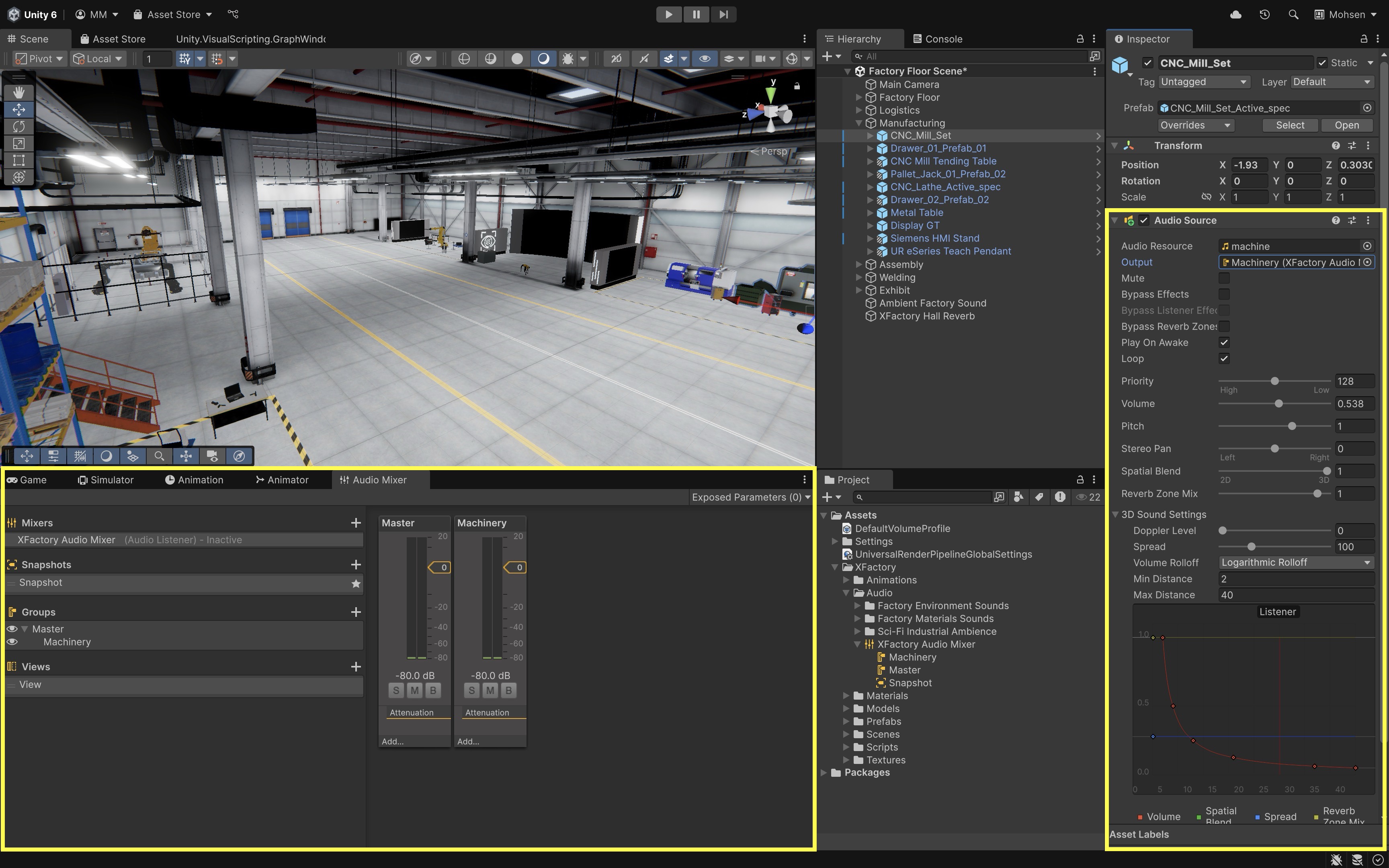
- Select an
- Fine-tune Audio Levels and Effects:
- In
Playmode, adjust volume sliders for real-time changes. - Add EQ or reverb effects to the
Machinerygroup to reflect distance or occlusion (e.g., sounds muffled by walls or partitions). Volume tweaks in Play Mode can also be checked through a Quest Link–connected Meta Quest headset.
Consider creating a
Voice Instructionsgroup for human guidance audio, and duck the volume of all other groups when the instructor is speaking. - In
User Interface

A user interface (UI) is a system that enables users to interact with an application. Unity has multiple UI systems, including uGUI (Canvas-based UI), UI Toolkit, and TextMeshPro. This session focuses on Canvas-based uGUI because it is widely used for runtime game UI, world-space UI, and XR interfaces. UI Toolkit is increasingly important for editor tools and some runtime UI workflows, but it is not the focus of this session. In XR, UI should be readable, reachable, and comfortable. World-space panels should be placed at a usable distance and angle, use large enough text and buttons, and avoid forcing users to hold their arms up for long periods.
In XFactory, UIs enable intuitive user interaction. Large screens at the exhibit, assembly, and production stations provide immersive visualizations and task guidance. Users can also interact with simulated CNC machine HMIs, Siemens PLC HMIs, and UR10e teach pendants to control machines or robots, mirroring real-world interfaces for realistic engineering simulation.
UI Foundations
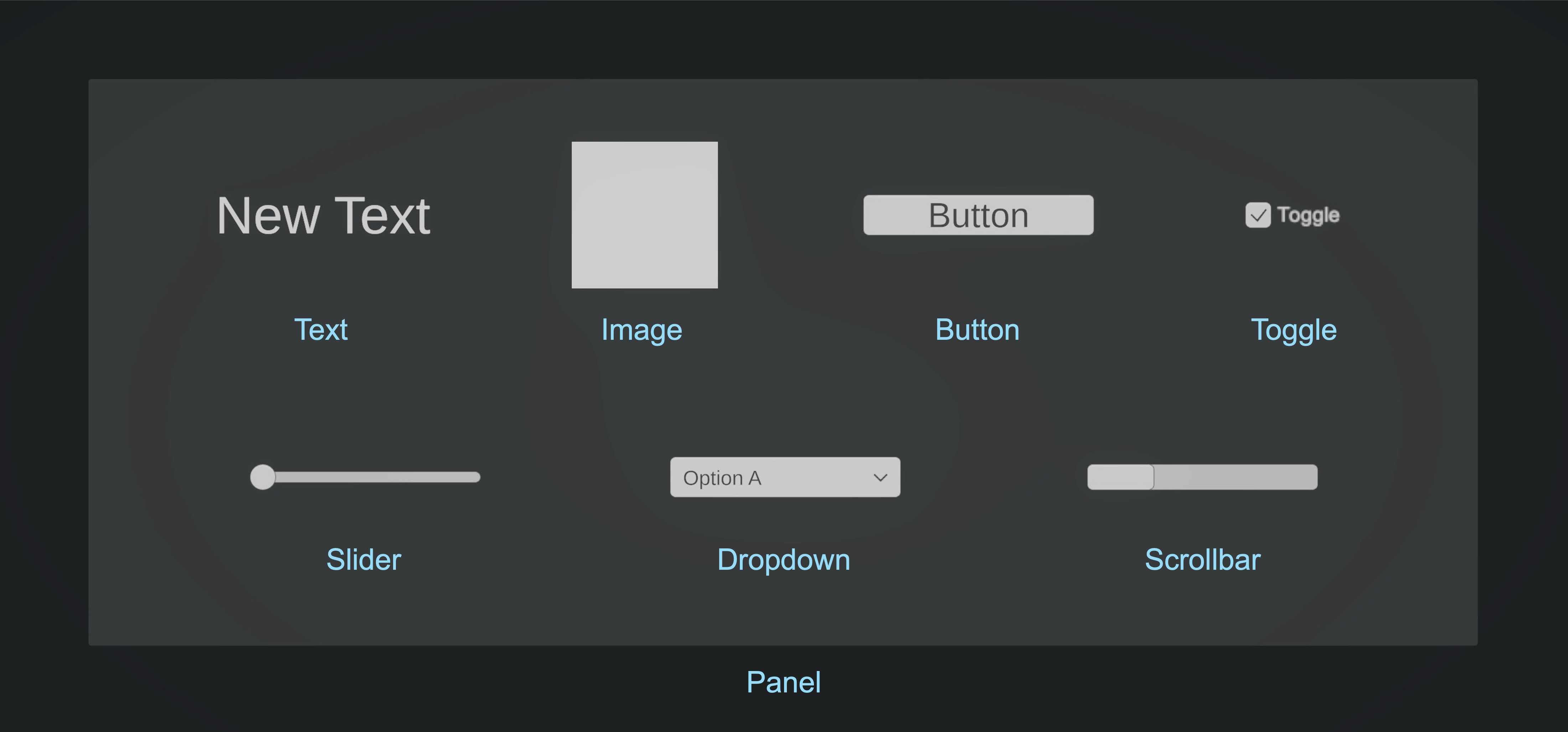
This section introduces the main building blocks of Unity’s Canvas-based UI workflow: common UI elements, layout tools, and the Event System that routes input to interactive controls.
TextMeshPro: The recommended text system for sharp, readable UI and 3D text. Use it for labels, instructions, status messages, and readouts. Example: Status messages or sensor readouts on a CNC machine interface in the manufacturing station.Image: Displays 2D sprites or textures in the UI. Can be used for backgrounds, icons, and decorative elements. Example: Machine logos or safety icons in a digital replica of a PLC HMI.Button: A clickable UI element that triggers an action. Can contain text and images to enhance visual representation. Example: Start/Stop buttons on an interactive robotic cell interface in the welding station.Toggle: A switch between two states (on/off). Useful for enabling/disabling settings. Example: Toggling between different camera views of the production station.Slider: Allows users to adjust a value within a defined range (e.g., volume, brightness). The handle can be moved to different positions. Example: Adjusting welding parameters or robot speeds in a robotics training module.Dropdown: A list of selectable options. Expands when clicked, allowing users to choose from multiple predefined values. Example: Selecting different product configurations on the assembly station UI.Input Field/TMP_InputField: Allows users to enter text or numbers. Useful for search fields, parameter entry, or configuration panels.Scrollbar: Provides scrolling functionality for UI elements that contain more content than can fit in the visible area. Example: Viewing a long instruction set or part list on a touchscreen in the exhibit station.Panel: A container for grouping UI elements together. Helps organize complex UI layouts. Example: A full-screen production dashboard in the exhibit station showcasing real-time KPIs.
For this course, use TextMeshPro versions of text, buttons, dropdowns, and input fields when available.
UI Layout Components
Unity provides several layout components to help structure UI dynamically:
-
Horizontal Layout Group: Aligns child UI elements horizontally with customizable spacing. Example: Displaying multiple control buttons on a teach pendant simulation.
-
Vertical Layout Group: Aligns child UI elements vertically, often used for menus and lists. Example: A step-by-step checklist for assembling components in the assembly station.
-
Grid Layout Group: Arranges child elements in a grid format, ideal for inventories and icon-based menus. Example: A grid of parts/components shown on the logistics station inventory screen.
Content Size Fitter: Automatically resizes UI elements based on their content.Aspect Ratio Fitter: Ensures an element maintains a specific aspect ratio, regardless of screen size.Canvas Scaler: Controls the overall scale and pixel density of UI elements in a Canvas. For screen-space UI, it helps layouts adapt to different resolutions. For world-space UI, it helps control pixel density and text sharpness.
UI Event System
Unity’s Event System is the core manager for all UI interactions. It listens for input from devices such as mouse/trackpad clicks, keyboard keys, touch gestures (on mobile or XR devices), and controllers (gamepads, joysticks, VR handsets). The input is passed through an Input Module (e.g., Standalone Input Module for the legacy Input Manager, or Input System UI Input Module for the new Input System). The Event System then queries one or more Raycasters to determine which UI element is under the pointer or focus, and finally dispatches the correct event (click, drag, submit, navigation) to that element. Common raycasters include:
Graphic Raycaster: Used for standard UI interactions onCanvaselements (buttons, toggles, sliders, etc.).Physics Raycaster: Used when UI input needs to hit 3D objects with colliders (e.g., pressing a button on a virtual PLC panel in a production station).Physics 2D Raycaster: Similar to the Physics Raycaster, but for 2D colliders in 2D projects.
If UI clicks are not registering during in-editor testing on macOS or with a trackpad, check the active Event System input module. Legacy Input Manager projects typically use
Standalone Input Module; projects using the newer Input System typically useInput System UI Input Module. Also confirm that the Canvas has aGraphic Raycaster, the UI element is interactable, and no invisible UI element is blocking the raycast.For XR world-space UI, the Event System must work together with the input/raycasting approach used by the project. Mouse input in the Editor, touchscreen input on mobile, and XR controller or hand-ray input may require different input modules or XR Interaction Toolkit UI components.
Canvas and UI Layout
This section explains how Unity positions and scales UI through the Canvas, RectTransform, and anchors. These concepts are especially important for world-space XR interfaces, where panels must remain readable, aligned, and comfortable in 3D space. When developing UI elements in Unity, ensuring they remain correctly positioned and proportionally sized across different screen sizes and aspect ratios is crucial. Unity provides tools like the Canvas, Anchor Points, and Canvas Scaler to help with responsive UI design. Let’s work on a running example to turn the large display in the assembly station (Display GT) into an interactive UI.
What Is a UI Canvas?
The Canvas is the foundation of Unity’s Canvas-based UI system. It acts as a container for all UI elements and determines how they are rendered on the screen. It represents the screen where UI components such as buttons, text, and images are displayed. UI elements must be placed inside a Canvas to be rendered properly. Every UI element must be a child of a Canvas to be visible. Different types of Canvas render modes include:
- Screen Space—Overlay: UI is rendered directly over the screen and does not require a camera. Best for menus, HUDs, and non-XR desktop/mobile overlays.
- Screen Space—Camera: UI is rendered by a specific camera and can interact with camera depth and perspective. Useful when the UI should be tied to a camera view.
- World Space: UI exists as geometry in the 3D scene. Best for in-world panels, machine HMIs, VR/AR control surfaces, floating labels, and interfaces that should be positioned relative to physical or virtual objects.
Example
To add and attach a Canvas to a large screen prefab in Unity:
- Add a
Canvas:- In the
Hierarchy, right-click on your large screen GameObject (e.g.,Display GT) and selectUI > Canvas. - This creates a new
Canvasas a child of the display. - Unity may also add an
EventSystemGameObject if it doesn’t already exist — this is required for UI interactions.
- In the
- Setup the
Canvasin theInspector:- Change the
Render ModetoWorld Space(required for placing UI on 3D surfaces). - Adjust the
RectTransform scaleto something small (e.g.,0.002, 0.002, 0.002) so it fits realistically on the screen surface. - Adjust
WidthandHeightas appropriate. - Resize and reposition the
Canvasso that it aligns with the visible screen area on your mesh. - Check the
Canvas Scalersettings. For world-space UI, use scale and pixel density settings that keep text sharp and readable at the expected viewing distance. - Confirm the Canvas has a
Graphic Raycastercomponent so UI elements can receive pointer events.
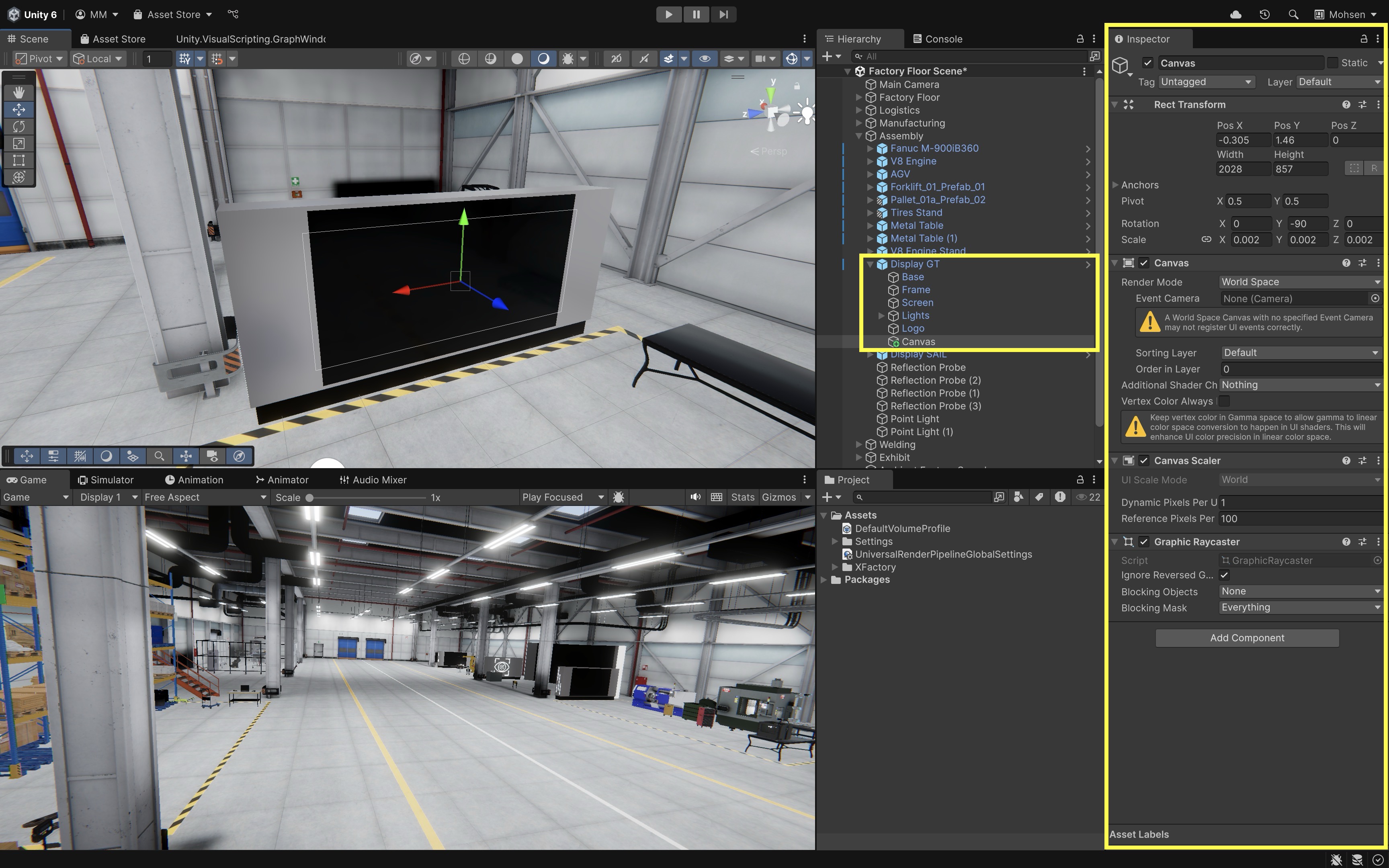
- Change the
- Edit in 2D (optional):
- Enable
2Dmode in theSceneview. - Make sure
Gizmosare enabled to see the Canvas outline. - Use the
Rect Tool(T) to position and scale the Canvas. - Double-click the
Canvasin theHierarchyto focus on it in theSceneview.
In XFactory,
Canvascan be used for a variety of applications. For example, a large interactive touch screen in the assembly station displays guides and instructions for assembling components like the V8 engine and the tire. This UI is built on aWorld SpaceCanvas, parented to the screen mesh, and aligned to its surface for immersive in-scene interaction using VR controllers. - Enable
RectTransform
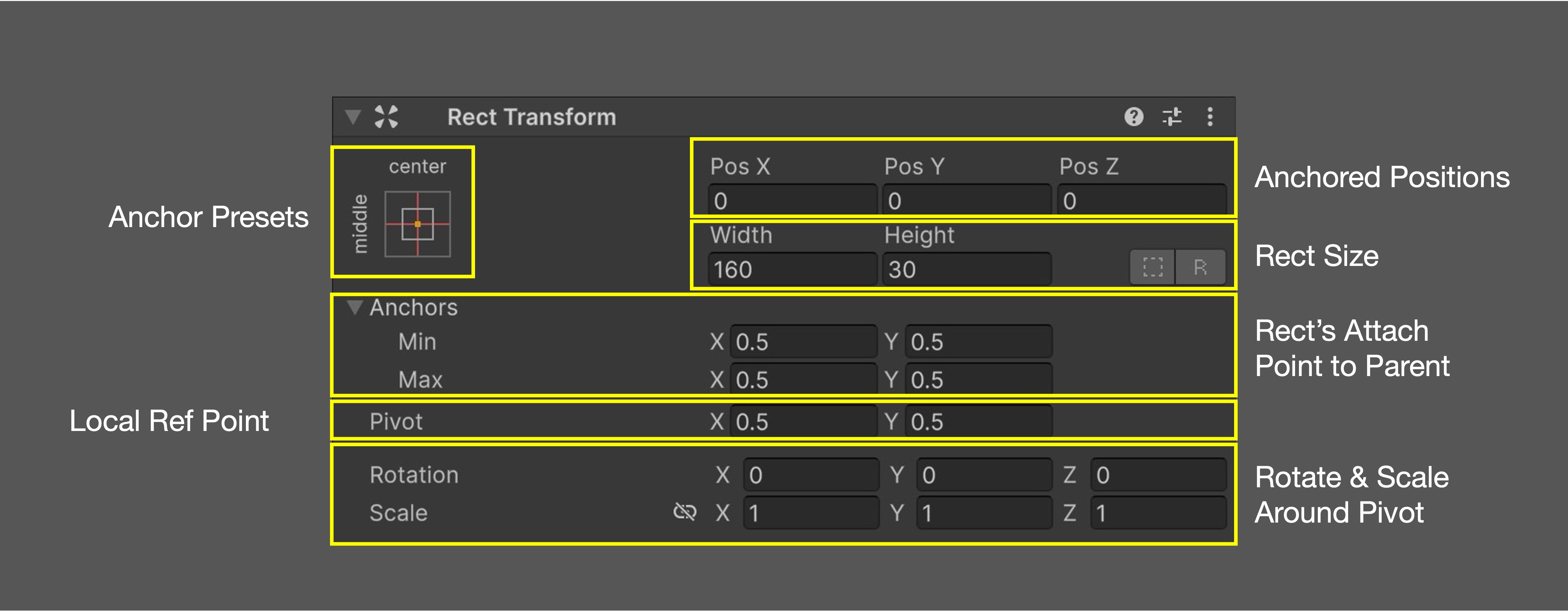
The RectTransform component is the UI-specific version of the Transform component used for GameObjects. It allows for precise control over UI element positioning, size, and alignment. Key RectTransform properties include:
Anchor Presets: The 9-grid box in theInspectorthat quickly sets anchors and alignment together (e.g., center, top-left, stretch). It configures bothAnchors Min/Maxand the element’s alignment.Pos X / Pos Y / Pos Z: The anchored position relative to the anchors.XandYare offsets in parent space.Zis only relevant for World-Space or Camera-Space canvases (ignored in Screen-Space Overlay).Width / Height: The explicit size of theRectwhen it is not stretched. If the axis is stretched, these fields are replaced byLeft/RightorTop/Bottomoffset values.Anchors (Min / Max): Normalized (0–1) values that define where theRectattaches to its parent. Identical Min/Max keeps the Rect fixed in size; different Min/Max makes it stretch along that axis.Pivot: The local reference point for positioning, rotation, and scaling. Defined in normalized values (0–1). For example, (0.5, 0.5) = center, (0, 1) = top-left.Rotation: Rotates the Rect around itsPivot. In world-space UI this tilts UI elements in 3D; in screen-space UI heavy rotation can cause text or sprites to look blurry.Scale: Scales theRectaround itsPivot. Typically best kept uniform (1,1,1). For crisp UI, adjust fonts and layout groups instead of scaling the entire element.
Anchors
Anchors define the UI element’s positioning relative to its parent, ensuring proper alignment when the Canvas scales or changes resolution. Each UI element on a Canvas has an anchor point, which determines how it moves and scales within the Canvas. To view and adjust anchors, select a UI element in the Hierarchy, press T or use the Rect Tool to access its Rect Transform, and look for blue circles (element bounds) and small triangles (anchor points). Here is an example of positioning UI with anchors:
- Create a
Buttonby right clicking theCanvasand selectingUI > Button - TextMeshPro. - Rename it
Engine Assembly Guideand edit its label. - Adjust the
Anchorby:- Clicking the
Anchorwidget and dragging it to the top right (manual), or - Clicking the
Anchor Presetsdropdown inRect Transformand choosing a top-right preset to snap the button into place.
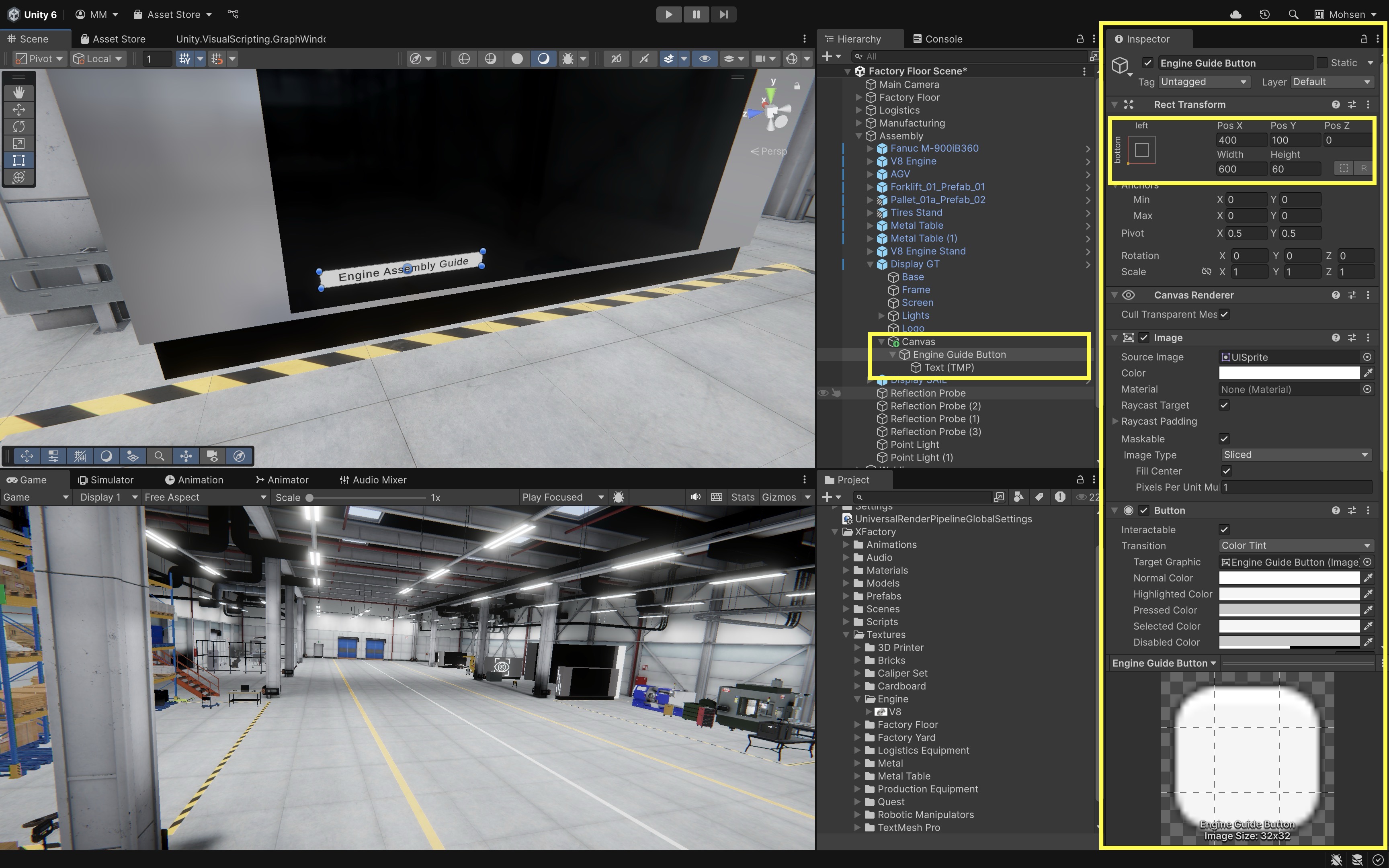
Anchors control how an element is positioned relative to its parent, while the
Canvas Scalercontrols how the overall UI scales across resolutions. Use both together for responsive screen-space UI. - Clicking the
UI Components
The following tutorials build the interactive parts of the XFactory touchscreen interface. They show how to add images, text, buttons, toggles, sliders, and scrollable content using Canvas-based UI components.
Image
In Unity UI, images play a crucial role in designing user interfaces, serving as backgrounds, icons, buttons, and decorative elements. In XFactory, images and backgrounds enhance realism for XR-based UIs. For example, on the assembly station touchscreen, image elements help visualize parts of the V8 engine or tire, and replicate the look of physical control panels or instructional dashboards.
For UI images, imported textures should usually be set to
Sprite (2D and UI)so they can be assigned to theSource Imagefield of anImagecomponent.
Adding a Background Image
A background image is commonly used in UI menus to enhance the visual appeal and structure of the interface. This is especially useful for building realistic in-world control screens or product guides. To add a background image:
- Create an
ImageObject:- In the
Hierarchy, right-click on theWorld Space Canvasand selectUI > Image. - Rename it to
Interactive Engine Diagram(or a relevant name). - This adds a resizable, white square anchored to the Canvas.
- Use the
Rect Tool(T) to resize and position the image to fill part of the screen or align with a product display area.
- In the
- Changing the Background Color & Transparency:
- In the
Inspector, locate theImage Component. - Use the
Color Pickerto assign a background color. - Assign an image of the V8 engine model (or something similar) to
Source Image.
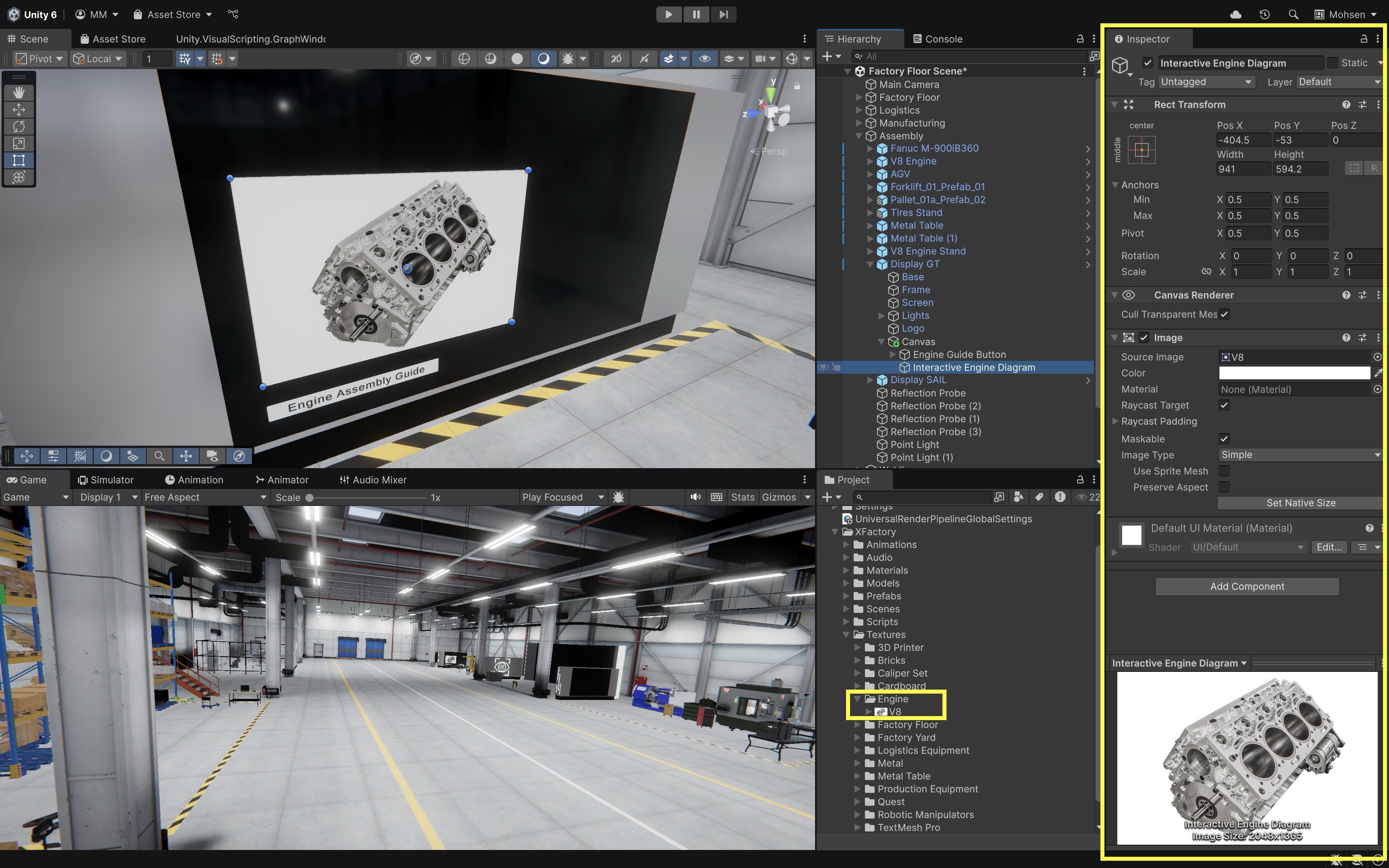
To import an image into Unity for UI, drag the image into the
Assetsfolder, select it, set theTexture TypetoSprite (2D and UI)in theInspector, and clickApply. - In the
Adding Text to UI
A title or label helps users understand the purpose of an interface panel or section. To add a title to your in-world touchscreen UI:
- Create a
TextObject:- In the
Hierarchy, right-click on the background image or panel. - Select
UI > Text - TextMeshPro.
- In the
- Customize the Text:
- Rename it to something like
V8 Engine Diagram. - In the
TextMeshPro - Text (UI)component, enter a title (e.g.,V8 Engine Diagram). - Adjust the font size, color, and alignment for readability.
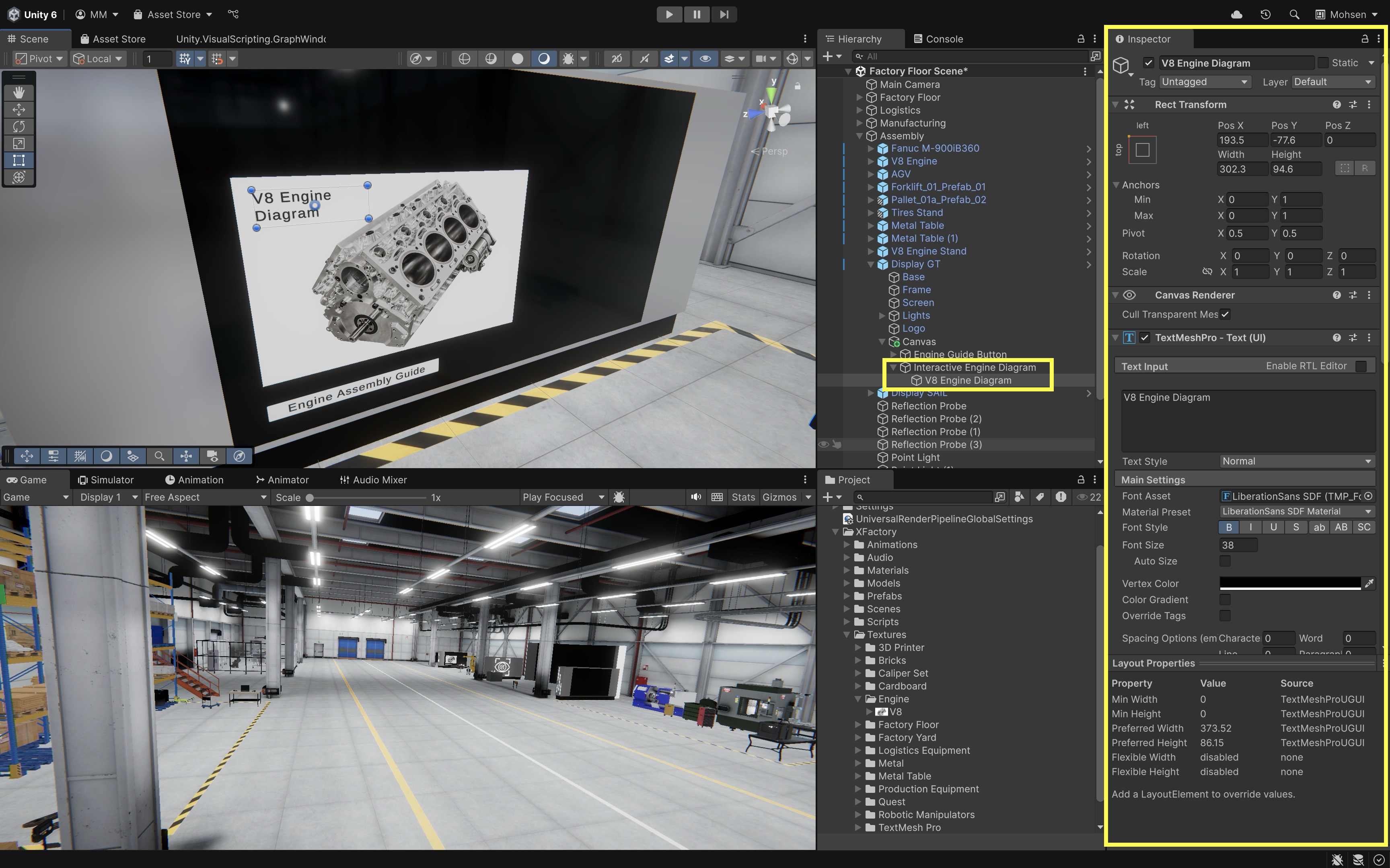
- Rename it to something like
Creating an Exit Button
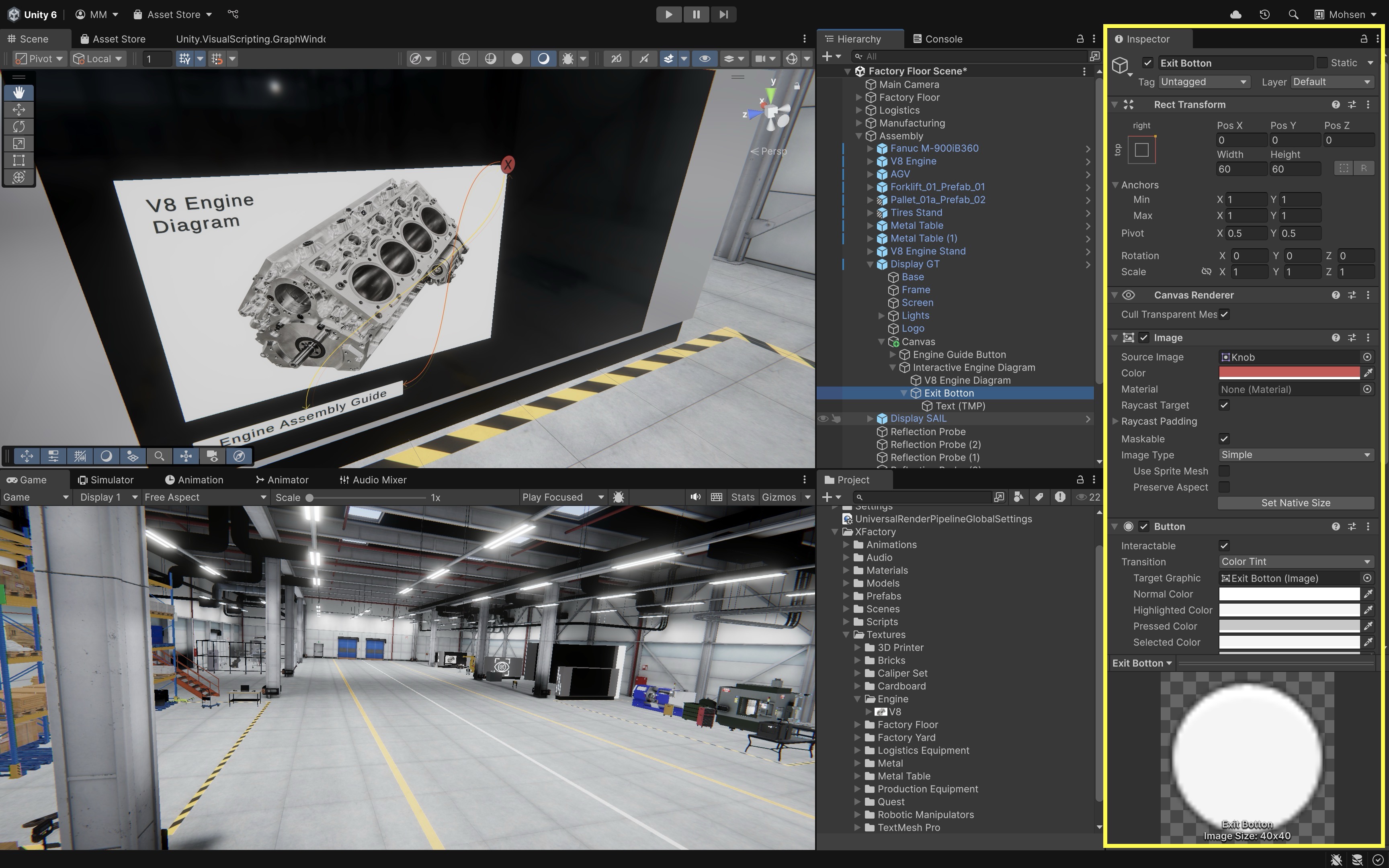
Every interface panel benefits from an Exit or Close button to allow users to return to the main screen or dismiss overlays. To add one:
- Create a
ButtonObject:- In the
Hierarchy, right-click within the background image panel. - Choose
UI > Button - TextMeshProand rename it toExit Button.
- In the
- Modify the Button Text:
- Expand the button in the
Hierarchy. - Select the child
Text (TMP)and change it toX.
- Expand the button in the
- Adjust Button Size and Position:
- Use the
Rect Toolto make the button a small square. - Move it to the upper-right corner of the background panel.
- Use the
Button
A button is a core UI element, enabling user interactions such as navigation, toggling settings, or triggering actions. Buttons are widely used across applications, from mobile keyboards to web search filters and game menus. In Unity, buttons are part of the UI system and are managed through the Button component. In XFactory, buttons might be used to start the robotic welding cycle, toggle between machine states on a CNC virtual HMI, or interact with task guidance menus in the assembly station.
Button Interactions
A well-designed UI provides clear feedback to users, ensuring they understand what can be interacted with and whether their actions were successful. Common button interactions include:
- Hover Effects: Buttons often change appearance when hovered over (e.g., color tint changes or slight enlargements).
- Click Effects: A more noticeable change occurs when the button is pressed, confirming interaction.
- Selection Effects: Some buttons stay highlighted after selection, indicating an active state.
Button Transition Colors
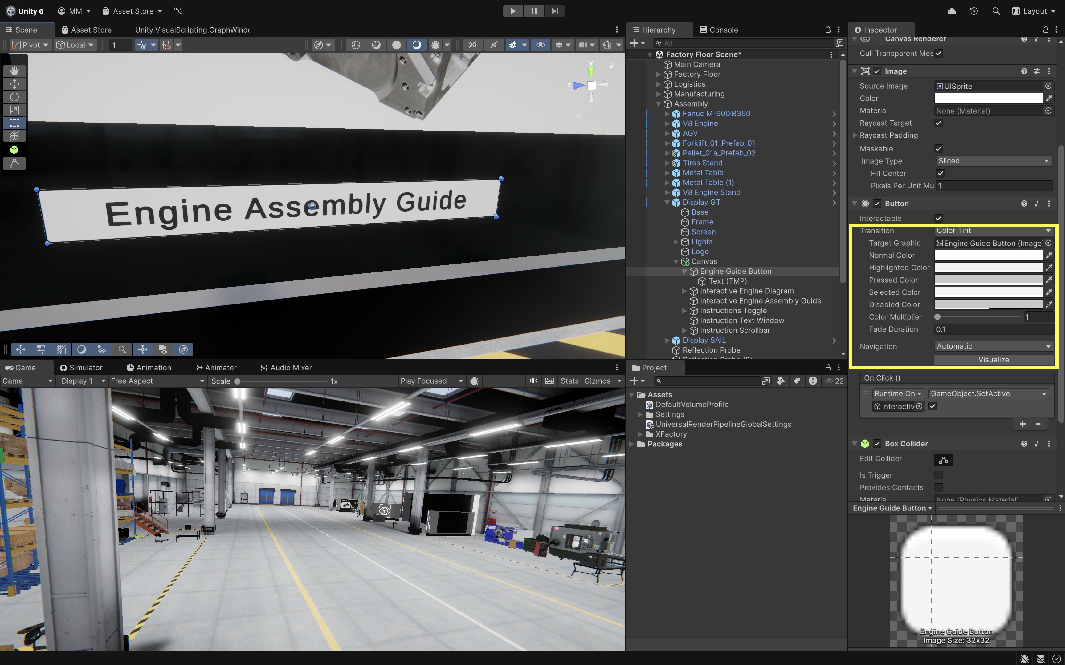
Unity provides various ways to visually indicate button interactions. By default, the Button component uses the Color Tint transition. To customize button colors:
-
Select the
ButtonGameObject in theHierarchy. -
In the
Inspector, locate theButtoncomponent. -
Find the
Transitionproperty (default:Color Tint). - Customize the following color properties:
Normal Color: Default color of the button.Highlighted Color: Color when hovered over.Pressed Color: Color when clicked.Disabled Color: Color when the button is inactive.Color Multiplier: Increases the tint effect (useful for dark or semi-transparent buttons).
Do not rely on color alone to communicate state. Use labels, icons, shape, motion, or sound/haptic feedback for important UI states.
- Test button colors.
- Run the Unity scene and hover over the button.
- Adjust the
HighlightedandPressedcolors for better visibility. - Experiment with different color combinations to improve UI clarity.
- Run the scene in Play Mode and, with Quest Link active, you can view the UI on a connected Meta Quest headset.
If UI clicks are not registering during in-editor testing, check the Event System input module, Canvas
Graphic Raycaster, buttonInteractablesetting, and whether another UI element is blocking the raycast. On macOS trackpads, input-module mismatches can appear as missed clicks.
On Click Event
A button in Unity becomes functional when an On Click event is assigned. This is managed using UnityEvents, which allow buttons to trigger actions when clicked. Let’s use On Click to toggle visibility of the V8 Engine Diagram on the assembly station touchscreen in XFactory.
- Set Initial Visibility:
- Deactivate the
Interactive Engine Diagram(which includes the image, title text, and exit button) in theInspectorby unchecking the checkbox next to the GameObject’s name. - Activate the
Engine Guide Button, which users will click to bring up the guide.
- Deactivate the
- Assign
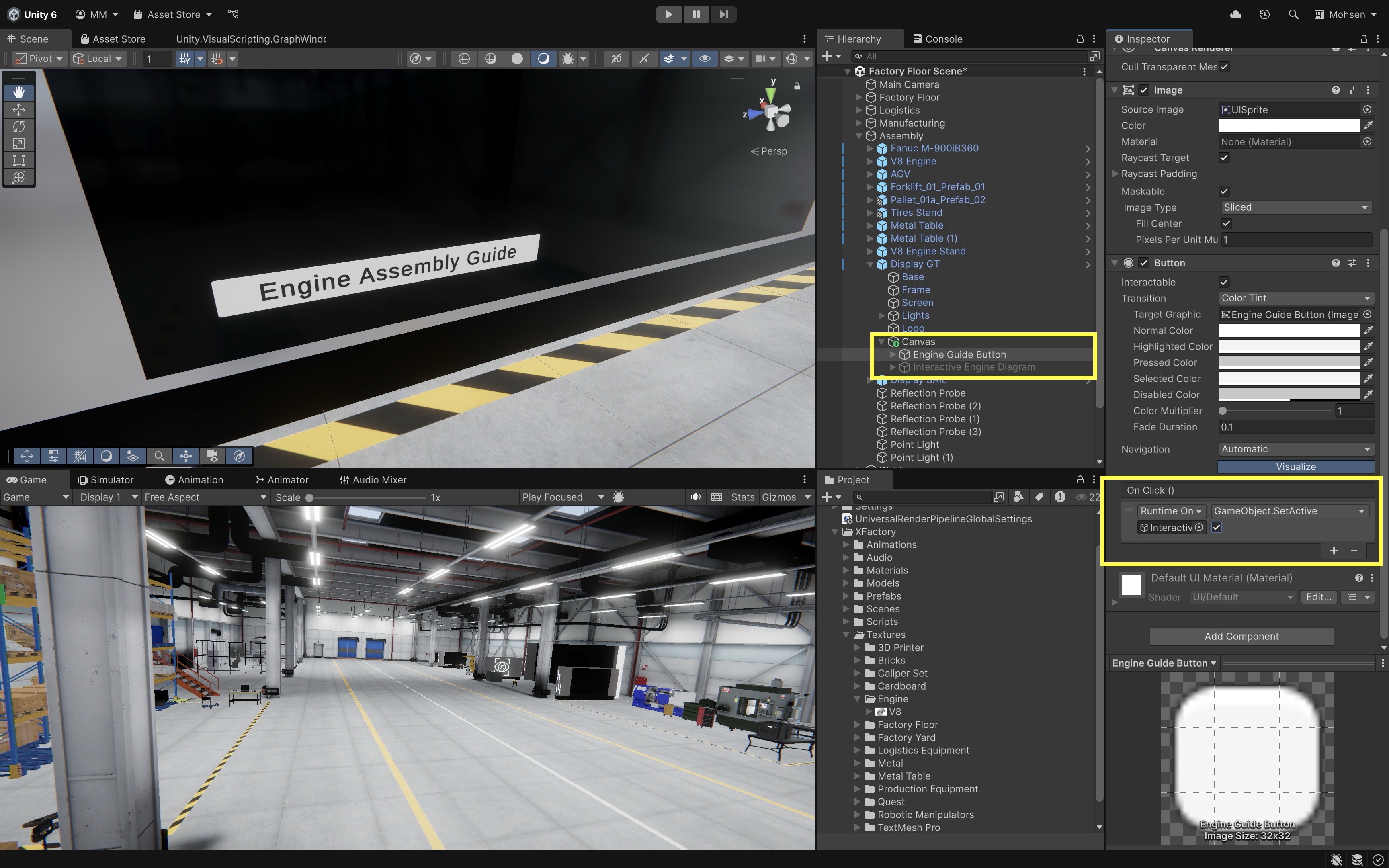
On Clickto Show the Guide:- Select the
Engine Guide Buttonin theHierarchy. - In the
Inspector, locate theButtoncomponent. - In the
On Click ()section, click the+button to add a new event. - Drag the
Interactive Engine DiagramGameObject into theObjectfield. - From the dropdown, choose
GameObject > SetActive (bool). Make sure the checkbox is enabled — this means the panel will be shown. - Now, clicking the
Engine Guide Buttonactivates the instructional overlay showing theInteractive Engine Diagramand related UI.
- Select the
- Assign
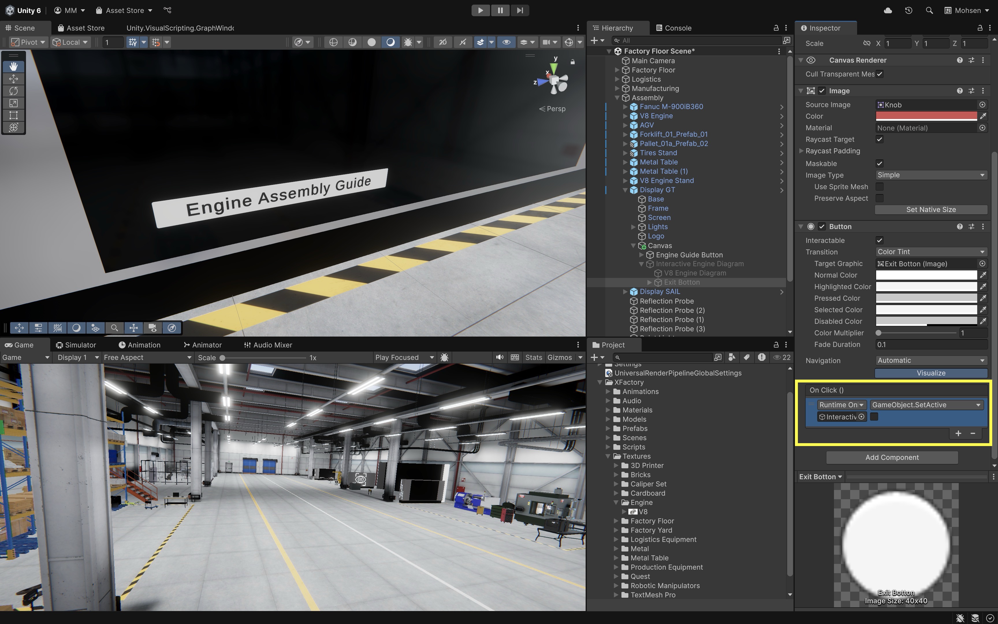
On Clickto Hide the Guide:- Select the
Exit ButtonGameObject in theHierarchy. - In the
On Click ()section of itsButtoncomponent, click the+button. - Drag the
Interactive Engine Diagraminto theObjectfield. - From the dropdown, choose
GameObject > SetActive (bool). Uncheck the box — this will hide the panel when the button is clicked. - Now, pressing the
Exit Buttonon the touchscreen will close the guide and return the user to the main UI.
- Select the
Toggle
A Toggle in Unity is a checkbox-like UI element that allows users to switch a setting between on (true) and off (false). In this tutorial, we’ll use a Toggle to show or hide an Assembly Instruction Text Window on the assembly station’s touchscreen.
- Create the
ToggleElement:- Right-click on the
Canvasin theHierarchy. - Navigate to
UI > ToggleorUI > Toggle - TextMeshProif that option is available in the current Unity project. - Rename it to
Instructions Toggle.
- Right-click on the
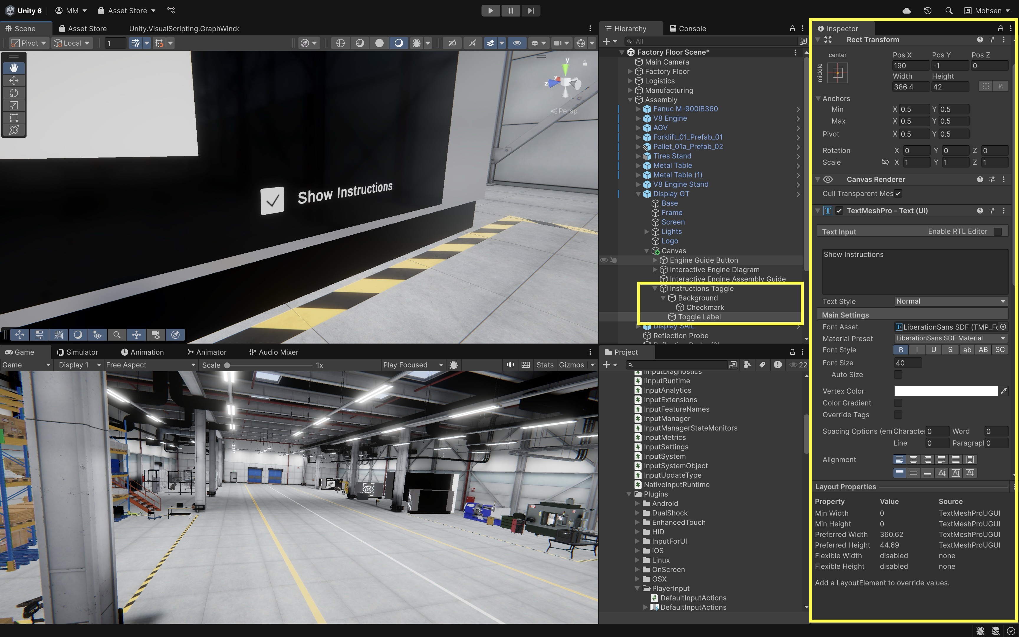
- Replace the Default Label:
- Expand
Instructions Togglein theHierarchy. - Delete the default
Labelchild. - Right-click on
Instructions Toggleand selectUI > Text - TextMeshPro. - Rename the new text to
Toggle Labeland set it toShow Instructions. - Use the
Rect Tool(T) to place the toggle somewhere visible on the large touchscreen, such as the bottom-right or top-right area.
- Expand
- Create the Instruction Text Window:
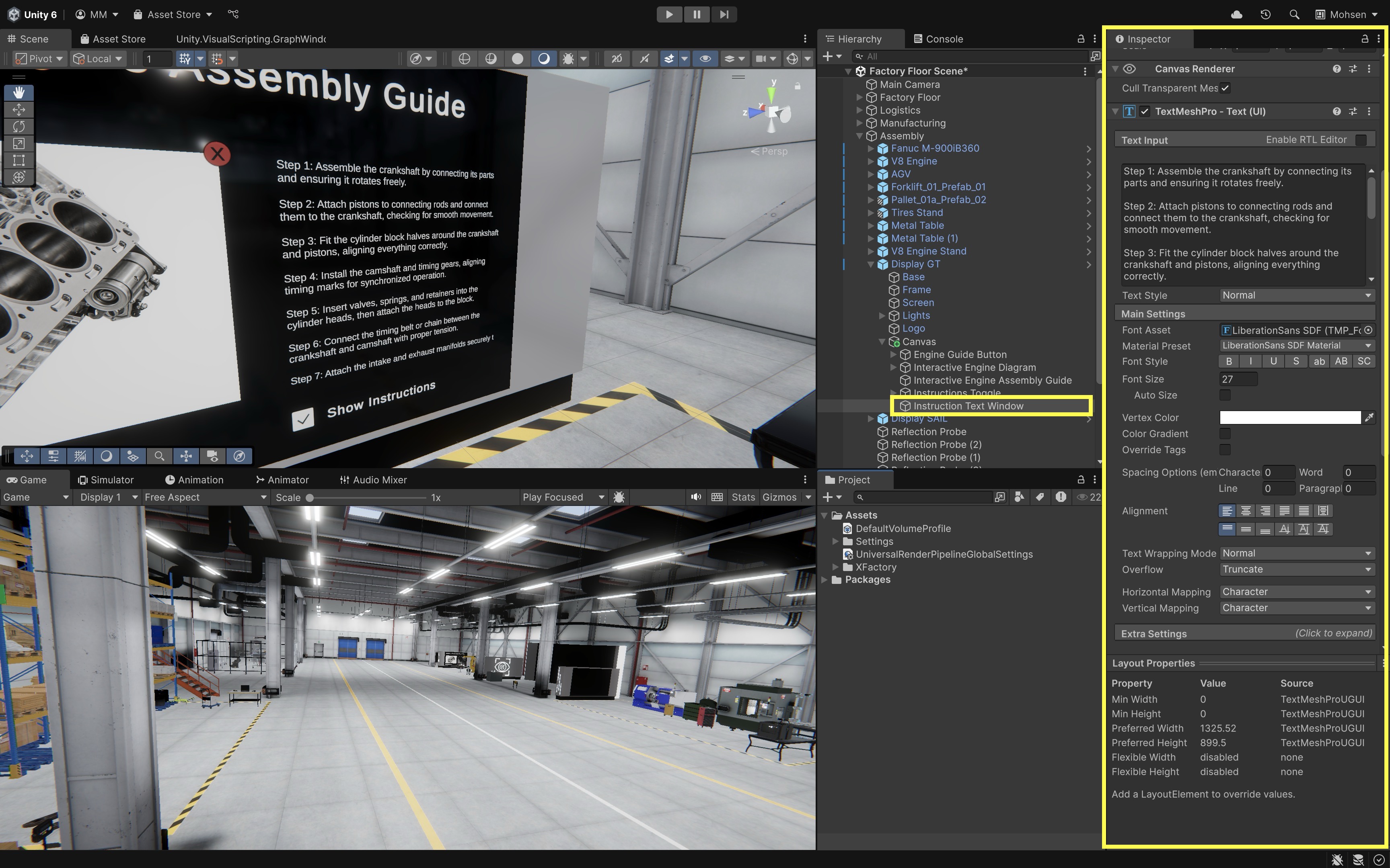
- Right-click the
Canvasand selectUI > Text - TextMeshPro. - Rename it to
Instruction Text Window. - Enter multi-line instructional content (e.g.,
Step 1: Assemble the crankshaft...\nStep 2: Attach pistons to connecting rods...). - Resize the
RectTransformto form a readable text box. - Set
Text Overflowto Truncate or Ellipsis in theInspector. - Disable this GameObject in the
Inspectorfor now — it will be toggled on/off by theToggle.
- Right-click the
- Make the
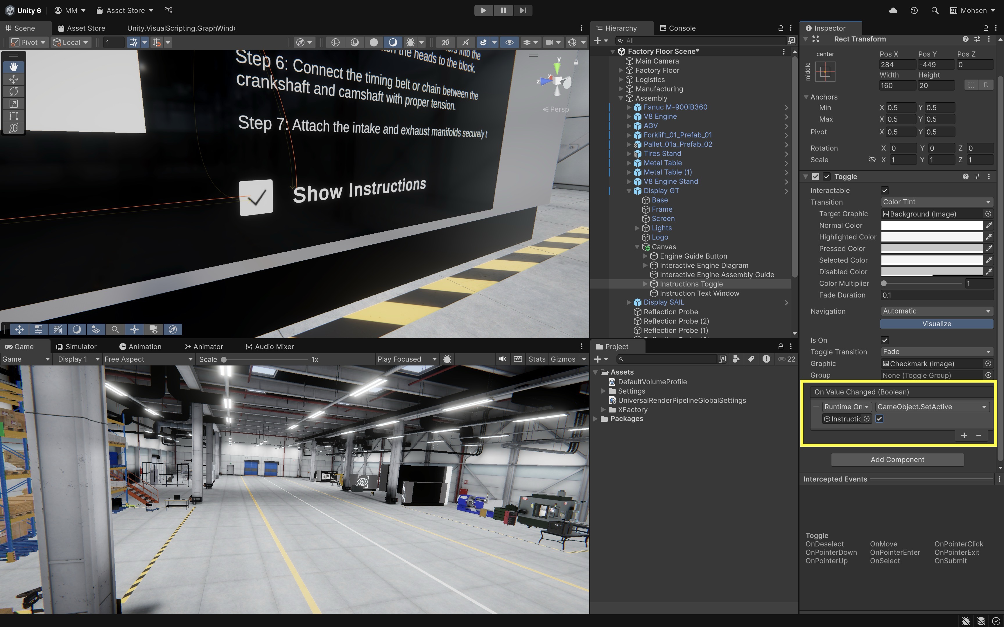
ToggleFunctional:- Select the
Instructions Toggle. - In the
Inspector, locate theTogglecomponent. - Find the
On Value Changed (Boolean)event. - Click the
+button. - Drag the
Instruction Text Windowinto theObjectfield. - From the dropdown, choose
GameObject > SetActive (bool). - When the toggle is on, the text window will be shown. When it’s off, it will be hidden.
The
On Value Changed (Boolean)event passes the toggle’s true/false state to compatible functions such asGameObject.SetActive(bool), which is why it works well for show/hide controls. - Select the
Slider
A Slider lets users adjust a numeric value within a defined range. In XFactory, sliders can control settings such as audio volume, robot speed, brightness, or simulation playback speed. Here, we will use a slider to control the volume of an Audio Source.
- Create the Slider:
- Right-click the
Canvasin theHierarchy. - Select
UI > Slider. - Rename it
Volume Slider. - Position it on the touchscreen UI using the
Rect Tool.
- Right-click the
- Configure Slider Values:
- Select
Volume Slider. - In the
Slidercomponent, setMin Value = 0,Max Value = 1, andValue = 0.5. - Add a
TextMeshProlabel nearby that readsVolume.
- Select
- Connect the Slider to an Audio Source:
- Select the
Volume Slider. - In the
Slidercomponent, findOn Value Changed (Single). - Click
+to add a new event. - Drag the target GameObject with the
Audio Sourceinto the object field. - If Unity exposes a compatible dynamic
AudioSource.volumeoption in the dropdown, select it. If not, use a small script later to receive the slider value and assign it toAudioSource.volume.
- Select the
- Test the Slider:
- Press
Play. - Move the slider and confirm the audio volume changes from quiet to loud.
- The volume change can also be heard through your Meta Quest headset when Quest Link is connected.
If the direct
AudioSource.volumeproperty is not available in the event dropdown, create a simple script later in Module C to receive the slider value and assign it to the audio source. The important concept is that a slider outputs a floating-point value, usually between0and1. - Press
Scrollbar
A Scrollbar in Unity allows users to scroll through content that exceeds the visible area of a container. If you already have a long Text - TextMeshPro object (like assembly instructions), you can make it scrollable by embedding it in a custom Scroll View using Unity’s Scroll Rect component. Let’s wrap the existing Instruction Text Window in a scrollable container and add a vertical scrollbar to the XFactory touchscreen UI. For many projects, Unity’s built-in UI > Scroll View prefab is faster and less error-prone than manually assembling a Scroll Rect, viewport, mask, content object, and scrollbar. The manual steps below are useful for learning how the system works.
- Create the Scrollbar:
- Right-click on the
Canvasand selectUI > Scrollbar. - Rename it to
Instruction Scrollbar. - Move and resize it to align with the side of the text area you want to scroll, commonly the right edge for a vertical scrollbar.
- In the
Scrollbarcomponent, setDirectiontoTop To Bottom.
- Right-click on the
- Create a Masked
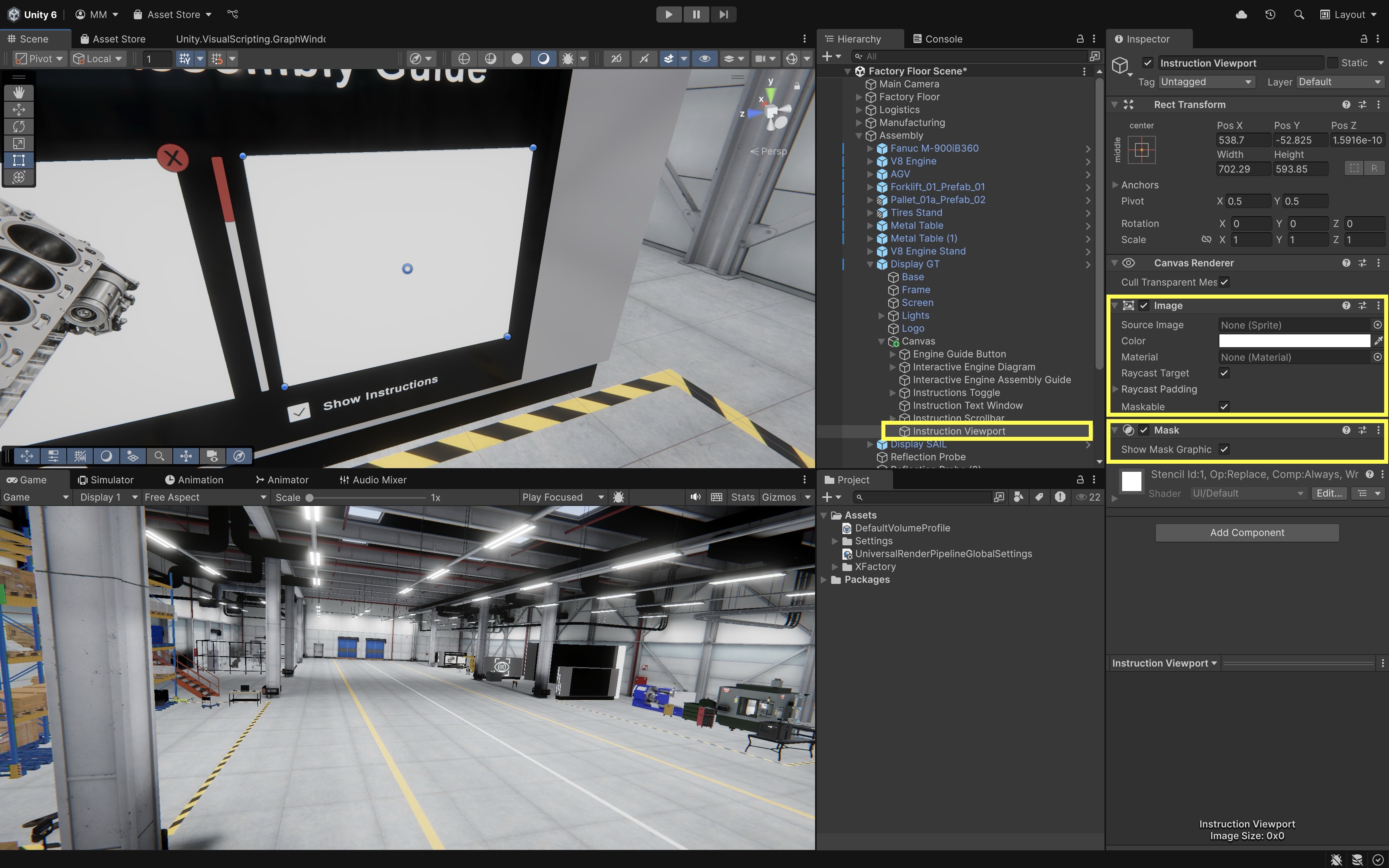
Viewport:- Right-click on the
Canvasand selectUI > Image. - Rename it to
Instruction Viewport. - In the
Inspector, add aRectMask2Dcomponent if the viewport is rectangular, or aMaskcomponent if you need image-based masking. - Optionally set
Image > Source ImagetoNonefor transparency. - Resize it to the visible area you want (e.g., same size and position as
Instruction Text Window). - Adjust the
Avalue underColorto make it transparent. - This defines the clipping region — only content inside this frame will be visible.
- Right-click on the
- Move the Existing Text Under the
Viewport:- Drag your existing
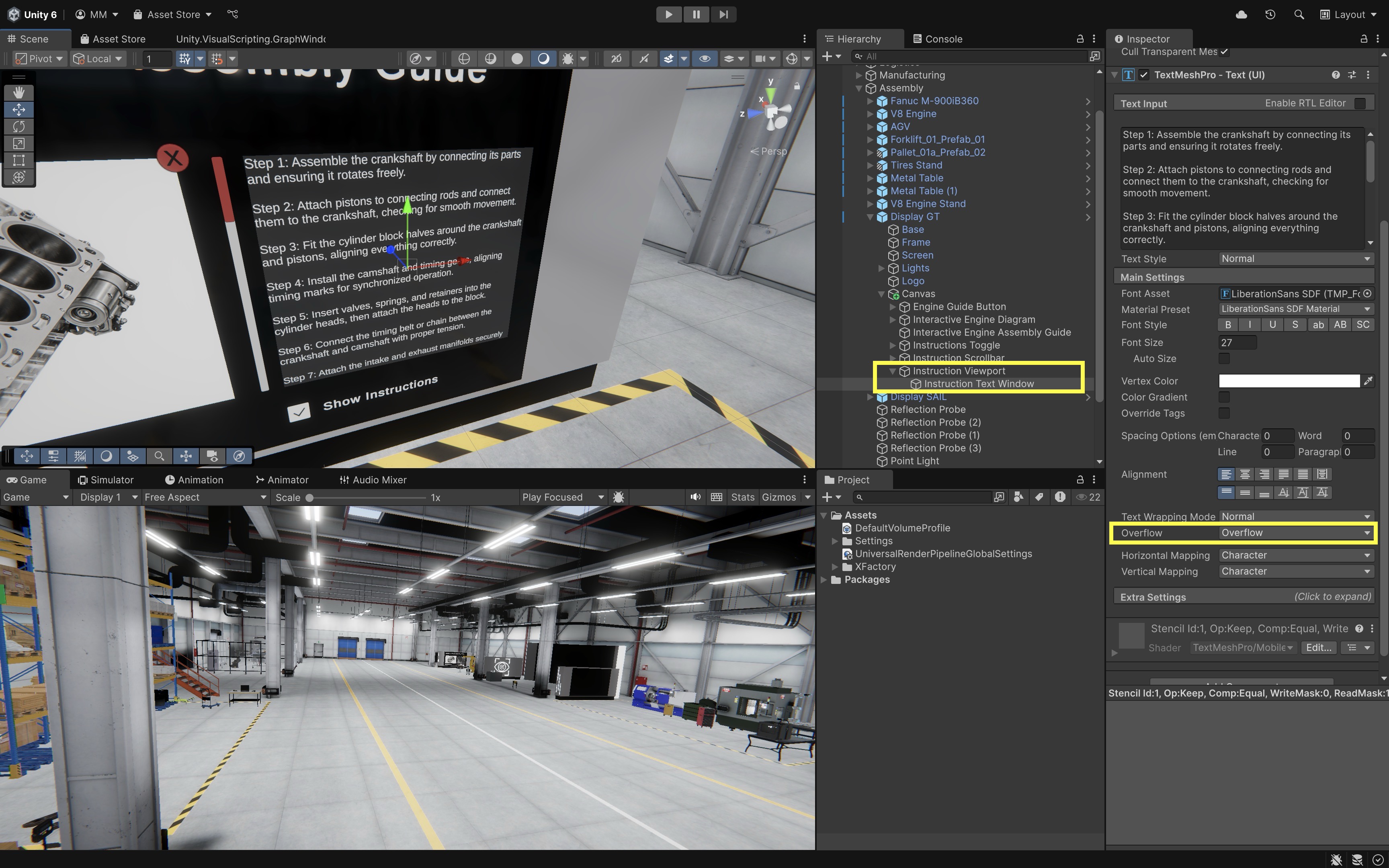
Instruction Text Window(Text - TextMeshPro) into theInstruction ViewportGameObject (make it a child). - Make sure that the
Instruction Text Windowis larger (taller) than theInstruction Viewport.
- Drag your existing
- Add a
Scroll RectComponent:- Select the scroll container object. If you are building this manually, this can be the
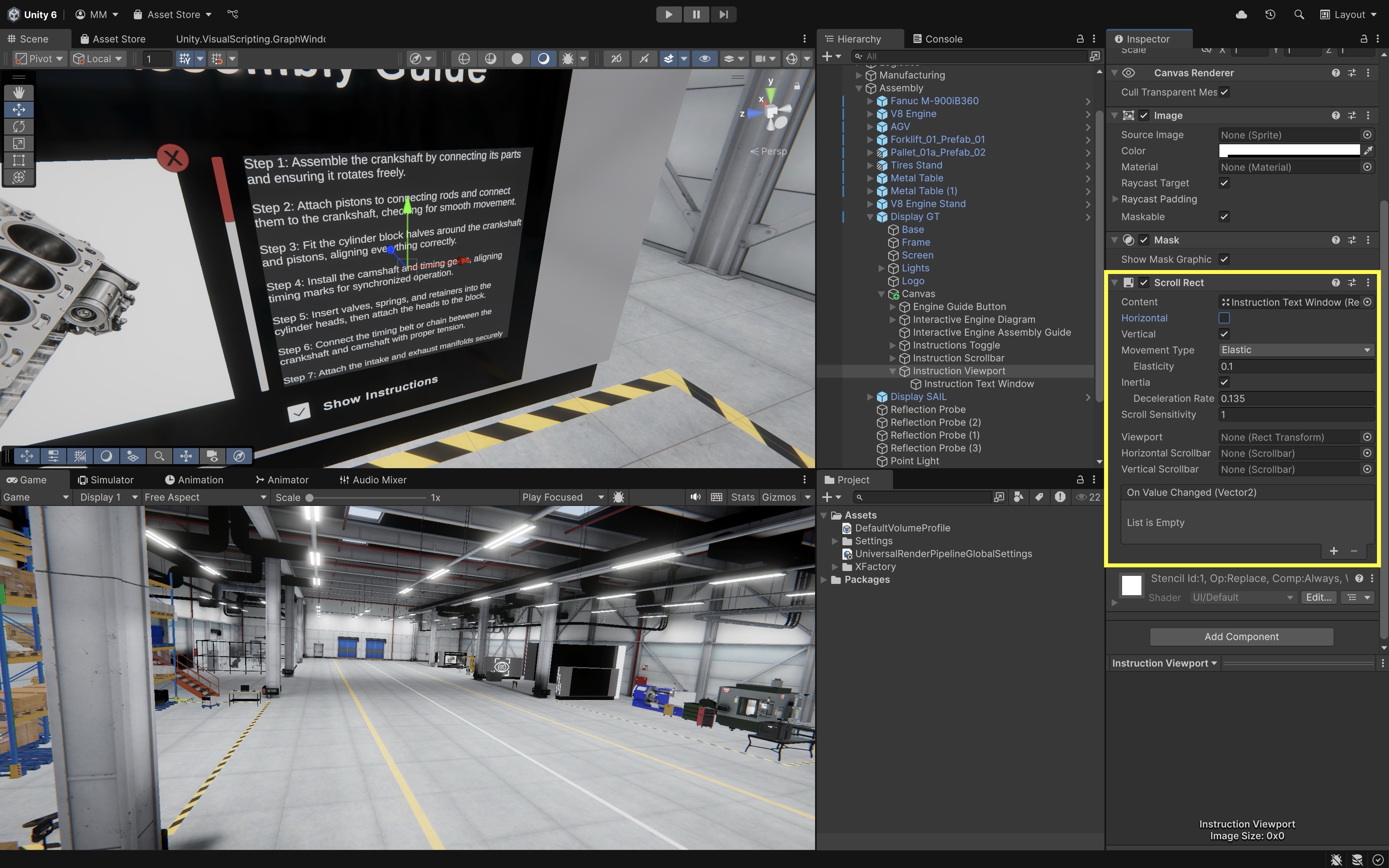
Instruction Viewport, but in a typical Scroll View hierarchy theScroll Rectis placed on a parentScroll Viewobject with a childViewportand childContent. - Click
Add Componentand chooseScroll Rect. - In the
Scroll Rectcomponent, drag theInstruction Text Windowinto theContentfield. - Set
Horizontalto disabled. - Set
Verticalto enabled. - Leave
Movement TypeasElastic(or change toClampedif preferred). - The
Scroll Rectnow links the visible viewport with the scrollable text content.
- Select the scroll container object. If you are building this manually, this can be the
- Link the
Scrollbarto theScroll Rect:- Select the scroll container object (with the
Scroll Rectcomponent). - In the
Scroll RectInspector, drag theInstruction Scrollbarinto theVertical Scrollbarfield. - The
Scrollbarnow controls the visible portion of the instructional text.
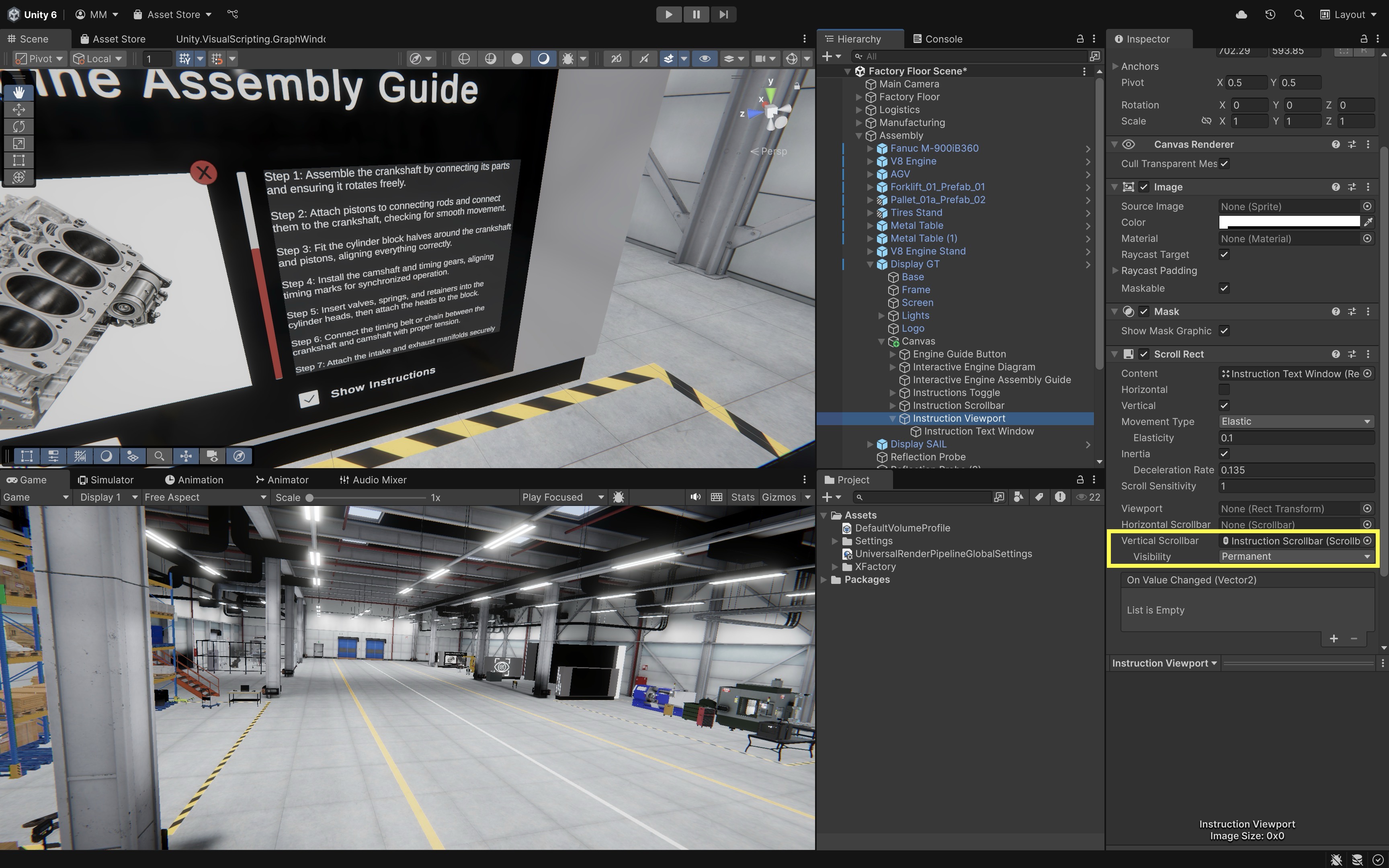
If it doesn’t scroll, ensure (a) the
Instruction Text Windowheight is taller than theInstruction Viewport, (b) the text alignment starts at the top of the content area (top-left pivot), and (c) theScroll RectandScrollbarare correctly assigned. - Select the scroll container object (with the
- Play and Test:
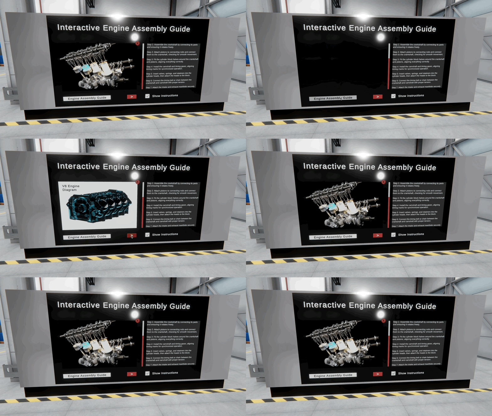
- Click the “Engine Assembly Guide” button to display the engine diagrams.
- Press the red “X” button to close the engine assembly diagram.
- Scroll through the assembly instructions using the vertical scrollbar.
- Toggle the “Show Instructions” checkbox to show or hide the assembly instruction panel.
- Move the Volume Slider and confirm the target Audio Source volume changes, or mark it for scripting follow-up if the direct event connection is not available.
- Confirm that the scrollbar and instruction text are hidden when toggled off, and reappear correctly when toggled on.
- Verify that all UI elements remain responsive during scene interaction.
- The touchscreen layout can also be viewed on a Quest Link–connected Meta Quest during Play Mode; full VR UI interaction arrives in Module D.
Key Takeaways
- Diegetic scene audio and non-diegetic UI/warning cues serve different communication roles in XR applications.
- Spatial audio, reverb zones, and Audio Mixer groups help users locate sources and manage loudness.
- World-space canvases with anchors and Canvas Scaler support readable panels placed in 3D environments.
- Buttons, toggles, sliders, and TextMeshPro panels are the standard UI building blocks for interactive scenes.
- Well-matched audio and UI reduce confusion, improve safety messaging, and strengthen immersion in training apps.